Advertising-The process of making a product known/liked and trusted by its market
Marketing-Covers all aspects of getting the product to the market
The advert i remember most would be the golden coin maker kids ad. I remember it due to its catchy and slightly annoying theme song here - Golden Coin Maker from John Adams - YouTube
Parts of adverts to identify-
Language
*Color
*Type of shot
*Angle
*Focus
*Depth of field
*mise-en-scene
*Realism
*Narrative
*use of text/copy
*Font design/size
*Layout
Representation
*which issues/values, groups or individuals get represented
*what kind of representations are constructed
Audience
*Target audience
*how do we know
*How is the audience attracted/positioned
GVA generated by UK advertising in 2019 - 17.1 billion GBP
Money spent on print advertising in 2019 UK - 1.37 billion GBP
Money spent on digital advertisement in 2019 UK - 16.5 billion GBP
The loreal advert creates a representation that suggests anyone who uses the product will look like Scarlett Johannsson - she essentially represents the product through her looks.
For the men's advert, the representation is Ryan Reynolds with very typically masculine features to show what that product represents.
INTERTEXTUALITY- One product referencing another product
TEXT CHALLENGE-
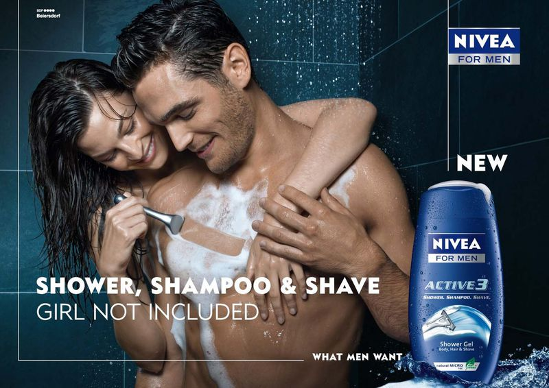
This ad uses a dual shot to show the type of relationship you 'would attain' if you used the product - Also uses dark and stereotypically 'manly' colours to show th emasculine target audience. The ad uses a bold font with no serifs to show th esimplicity of the product making it seem almost second nature to use. Uses Z framing to tend to a western audience. the representation of the stereotypical ways of a woman 'serving her man' is shown by her physically shaving the male actor - this entices the male audience as it makes them pine for that sort of lifestyle despite probably being untouched by the opposite sex if they use a 3 in 1 product. Furthermore the slogan 'what men want' creates almost a hyperreal situation where it suggests that those who dont use the product arent masculine enough. The bold title new suggests that its a new and innovative product which catches the eyes of many. The image is pretty sexualised as well to once again reach their target audience and entice them. The preffered meaning of this product is to push masculinity and reach the male audience - this is done by the repeated use of the phrase for mensuggesting that only men can use this product thus giving a hint of exclusivity. Humour is used


No comments:
Post a Comment